below average
Pictiny: Meh Thumbnails, Meh Promises
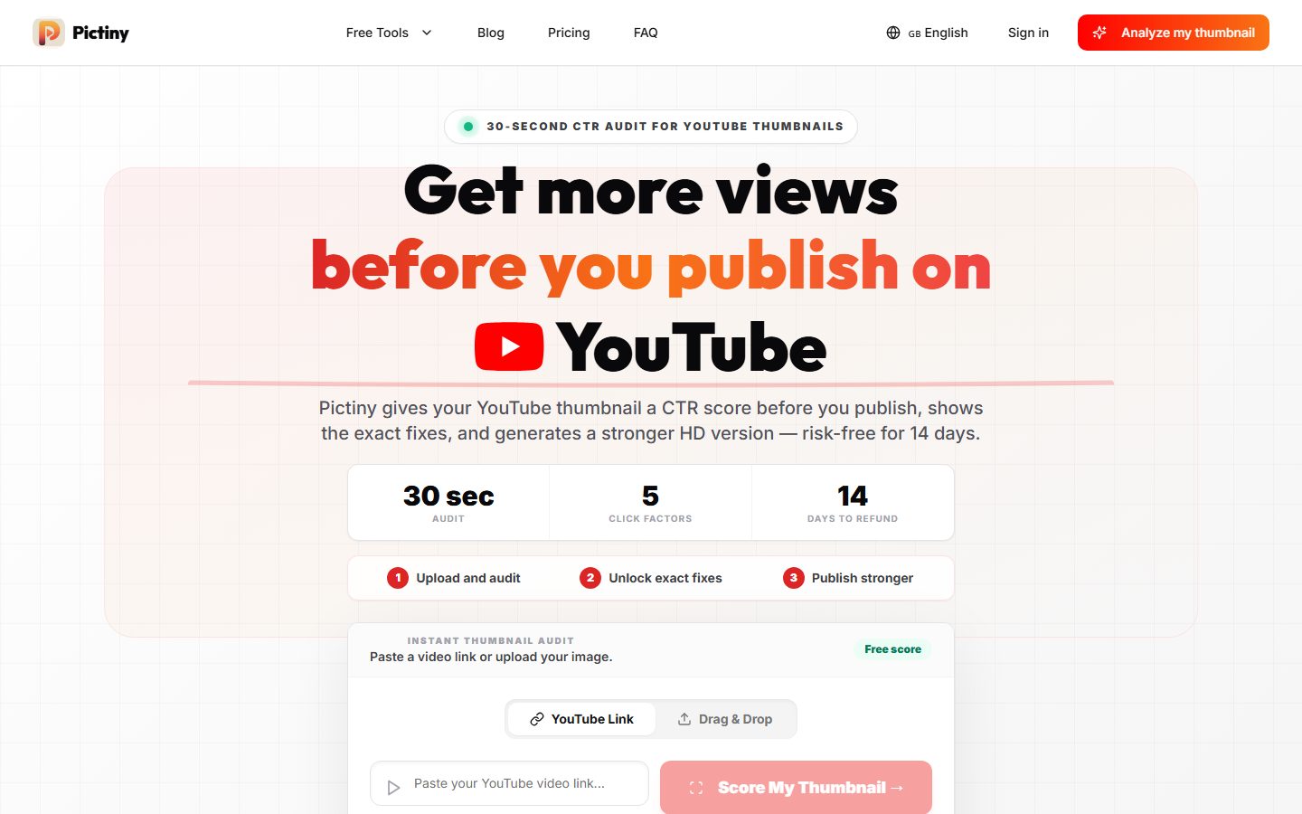
Pictiny’s landing page tries to do too much with too little personality, leaving you squinting to figure out what exactly you’re getting beyond a “CTR score” for YouTube thumbnails. The headline shouts “Get more views” but feels like a bland promise stapled to a generic YouTube icon — thrilling, right? The copy lazily repeats basic ideas without explaining why their fixes are better or unique. It boasts “exact fixes” and “stronger HD versions,” but doesn’t back either up with compelling proof or examples. The multiple CTAs like “Analyze my thumbnail” and “Score My Thumbnail” are confusingly scattered and lack urgency. Design-wise, the grid background and scattered text blocks feel uninspired, while vital social proof or testimonials are completely absent, making you question if anyone actually trusts this tool. This page is a textbook case of style over substance, begging for sharper positioning and a ruthless edit.
How the 49 breaks down
- Clarity
- 13/20
- Value prop
- 11/20
- Call to action
- 10/20
- Design
- 12/20
- Trust
- 3/20
The people's verdict
3 votes