below average
Basecamp: The Cluttered Bore of Project PM
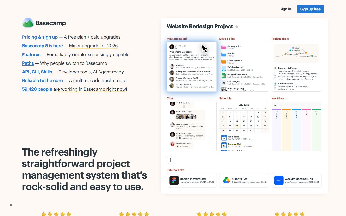
Basecamp’s landing page tries to sell you simplicity but drowns you in a cluttered mess of hyperlinks, half-hearted screenshots, and vague buzzwords. "Rock-solid and easy to use" sounds like the core pitch, yet there’s no punch behind it—no clear differentiation beyond the tired "multi-decade track record" boasting. The layout awkwardly jam-packs internal navigation options where visitors expect a clear headline and a strong call to action, which is buried beneath weak 'Take a 3 minute tour' nonsense. Social proof is plastered down low with tepid testimonials that read like corporate brochure filler, and the interface screenshot is a snooze-fest showing off a jumble of tiny UI elements that demand squinting. If you came here to discover why to choose Basecamp, prepare to squint, scroll, and guess. It’s a bland brochure pretending to be a product landing page, with zero urgency or excitement to get you signed up.
How the 43 breaks down
- Clarity
- 8/20
- Value prop
- 7/20
- Call to action
- 6/20
- Design
- 10/20
- Trust
- 12/20