solid
Stripe's Blanket Boil: Jargon Soup with Logo Garnish
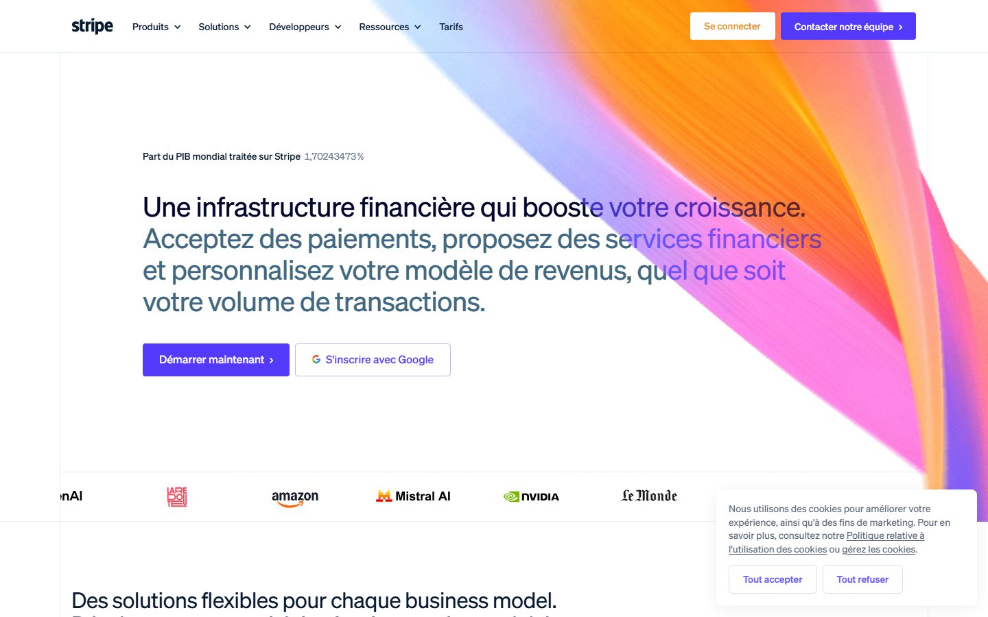
Stripe’s homepage is a masterclass in unambiguous clarity mixed with an overcooked slice of corporate jargon soufflé. The headline screams "infrastructure financiale" but feels about as personal as a tax form with half the benefit obscured behind fuzzy buzzwords like "booste votre croissance"—nice, but how? The vague, catch-all value prop tries to juggle payments, financial services, and revenue models at once without clearly separating who exactly benefits or why they should care immediately. CTAs are bold and obvious, though the second "S'inscrire avec Google" dilutes the urgency a bit. Design is clean and modern, but the pastel abstract background does zero storytelling and the giant rounded buttons feel like they belong in a dating app, not a fintech powerhouse. Credit where it’s due: trust signals with global logos top-notch. Overall, an elegantly sterile homepage that could benefit from swapping some buzzwords for concrete, human benefits straight away.
How the 74 breaks down
- Clarity
- 14/20
- Value prop
- 11/20
- Call to action
- 15/20
- Design
- 16/20
- Trust
- 18/20