average
Webflow: Growth Engine or Buzzword Generator?
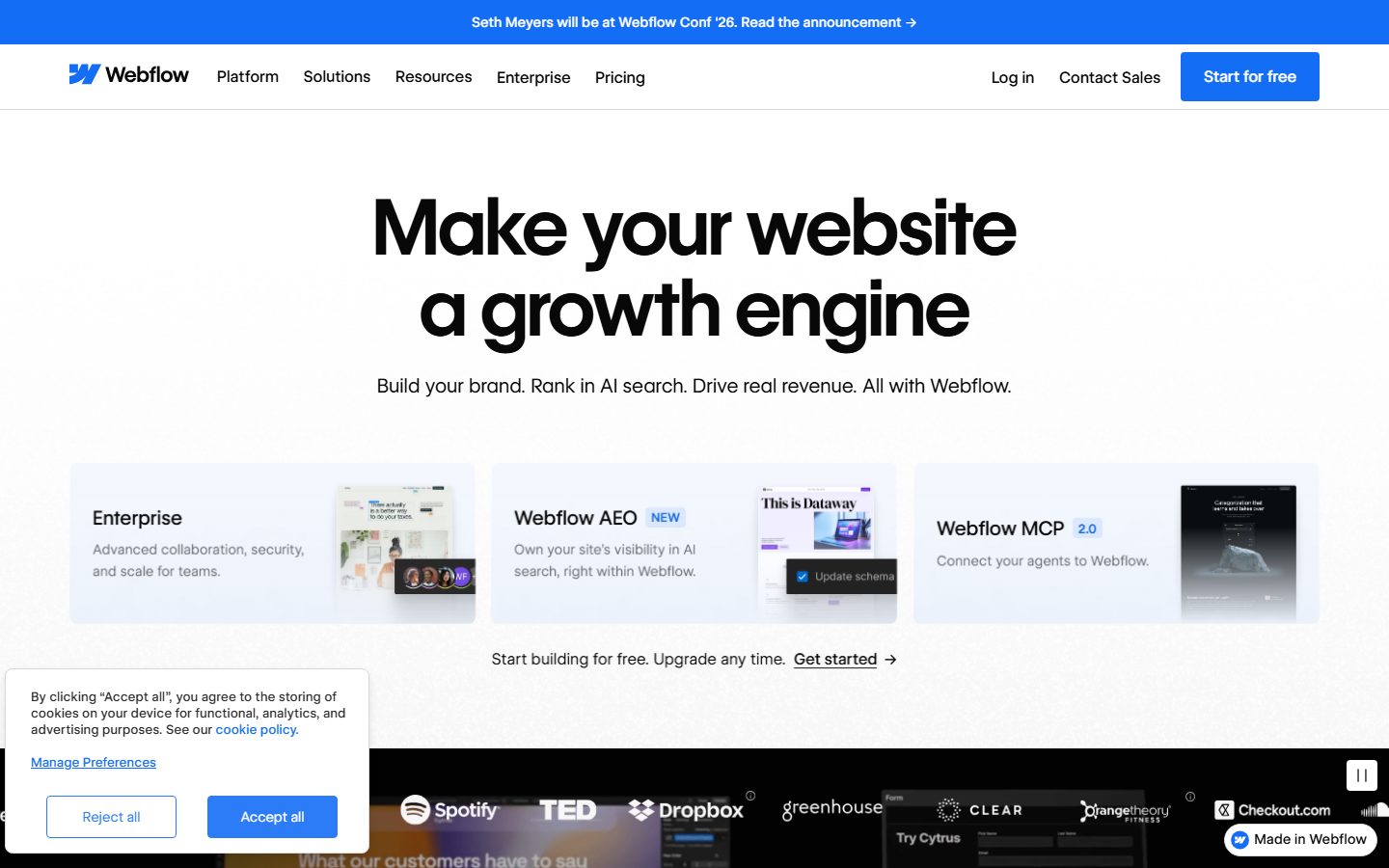
Webflow's landing page tries to juice the usual buzzwords—"growth engine," "AI search," "real revenue"—but it ends up serving a bland corporate smoothie that barely distinguishes itself from the sea of SaaS sameness. The promise to "connect your agents" is baffling without context, and the scattered sub-feature listings like Webflow AEO and MCP are jargon bombs that fail to enlighten or excite. The page assumes you already know what Webflow actually does, throwing around terms like "advanced collaboration" and "enterprise scale" without illustrating how any of it translates into real user value. The design is clean but sterile, lacking an emotional hook or storytelling heft. CTA buttons are present but overshadowed by a navigation menu and cookie consent that fight for attention. Social proof is relegated to a faint band of logos at the bottom, struggling to lend credibility to an otherwise generic pitch. Overall, it’s polished enough to not be painful but utterly forgettable and confusing for newcomers.
How the 56 breaks down
- Clarity
- 11/20
- Value prop
- 9/20
- Call to action
- 12/20
- Design
- 14/20
- Trust
- 10/20