below average
Buzzword Overload Meets Cluttered Confusion
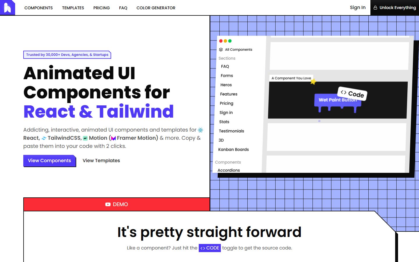
Hover.dev tries way too hard to convince you it’s the secret sauce for React and Tailwind developers with hype-laden phrases like “dope-ness increase of over 9000%,” which screams desperation rather than confidence. The above-the-fold copy is a cluttered mess of buzzwords and icons that add noise without clarifying actual value, while the plethora of navigation links and component categories invite confusion, not action. The CTA "Unlock Everything" sounds more like a shady video game cheat than a professional invite to buy. The design leans on a bland grid background and tiny screenshots that don’t showcase the product’s strength or uniqueness. There’s a faint hint of social proof but it’s buried and vague—30,000 users, sure, but who are they and why do they care? If your product is complex, your landing page should be obsessively clear and focused, but Hover.dev feels like it’s trying to do too much at once and failing to do any of it well.
How the 45 breaks down
- Clarity
- 10/20
- Value prop
- 9/20
- Call to action
- 7/20
- Design
- 11/20
- Trust
- 8/20