rough
Burn Notice: Where Roasts Get Lost in Translation
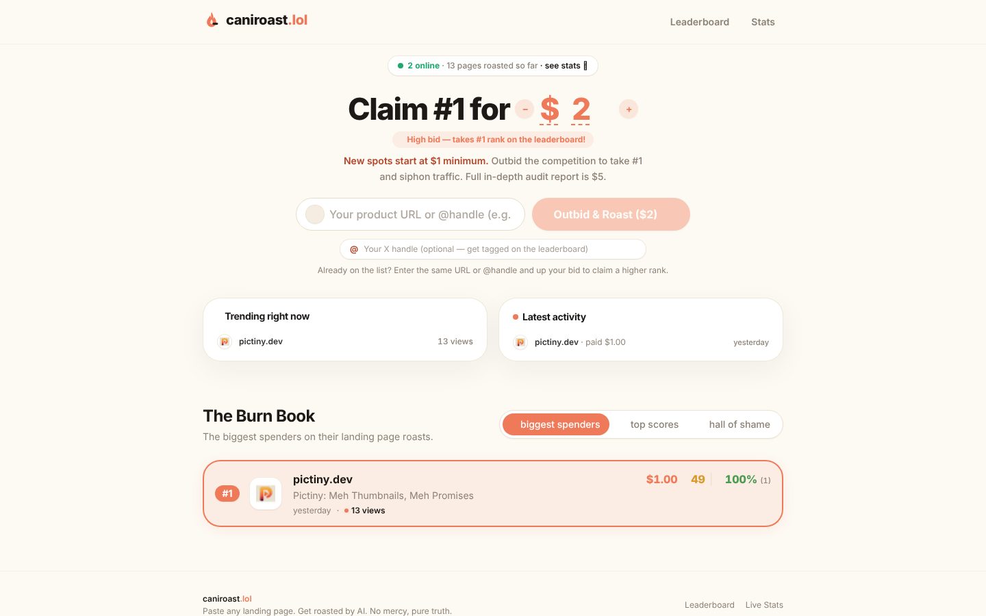
caniroast.lol tries to be the stand-up comedian at the tech party but ends up more like that awkward dude in the corner nobody quite gets. The value proposition is buried under a weird auction mechanic for "claiming #1" spots and a confusing ask to pay for roasting your landing page—because who wouldn't want to pony up just to get insulted by a bot? The copy is a mashup of jargon and vague threats, leaving visitors squinting to figure out who this is for or what they're really getting. The design feels like a timid pastel kid trying to be edgy with tiny flame emojis, but the layout is cluttered, with odd spacing and an overload of stats nobody asked for. There's a leaderboard for who spent the most roasting, which somehow makes it less fun and more like a bizarre pay-to-play popularity contest. CTAs are timid and buried next to confusing inputs, and there's basically zero trust signals beyond a few tiny user stats from probably the same person. This page needs a major roast itself.
How the 33 breaks down
- Clarity
- 7/20
- Value prop
- 6/20
- Call to action
- 8/20
- Design
- 9/20
- Trust
- 3/20
The people's verdict
3 votes