average
Buzzword Bingo Party: AI Means Nothing Here
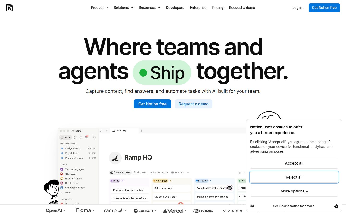
Notion's landing page tries to wear the 'AI-powered workspace' badge but ends up feeling like a buzzword bingo board with zero soul or specificity. 'Where teams and agents ship together' sounds like a cryptic riddle rather than a benefit, leaving you wondering what you're even signing up for. The copy is so generic it could be copy-pasted onto any SaaS site without raising eyebrows. Two CTAs, 'Get Notion free' and 'Request a demo,' fight for attention with the same visual weight, confusing the next move. The design is clean but safe to the point of sterile, with visual hierarchy crammed into giant text and pale buttons that don't pop. Social proof is just a row of logos — no juicy case studies or numbers to build trust. It feels like a polished template that forgot to tell a story or sell a damn thing. This is SaaS blandness at its peak, wrapped in AI hype icing.
How the 50 breaks down
- Clarity
- 11/20
- Value prop
- 7/20
- Call to action
- 10/20
- Design
- 14/20
- Trust
- 8/20